Fear of standing out: why brands are scared to push (colourful) boundaries
In the world of food and drink, embracing colour can make you stand out, but too many brands are happy to bask in the banality of beige. Kristy Snell, Creative Director at Chuck Studios, explains how that's a mistake, and why having your colourful cake and eating it is the way to a consumer's heart.
Most humans like to be part of everything, missing out on nothing. We even have a saying for it: FOMO — the fear of missing out.
But there’s a new catchphrase in town: FOSO – the fear of standing out.
In general, we tend to make conservative choices when it comes to our lives, with most of us avoiding loud, extreme colour choices, opting instead for greys and whites, more neutral colours. Typically unproblematic, until marketers make the mistake of inserting their personal likes and dislikes into their brand strategy.
“Colour is the single most important product-intrinsic sensory cue regarding the likely taste and flavour of food and drink.”
As tempting - or even as unintentional - as this may be, it runs the risk of brands making safe choices, particularly when it comes to using colour. Sailing them away from distinction and into a sea of sameness. As the psychologist Charles Spence said, “Colour is the single most important product-intrinsic sensory cue when it comes to setting people’s expectations regarding the likely taste and flavour of food and drink.”
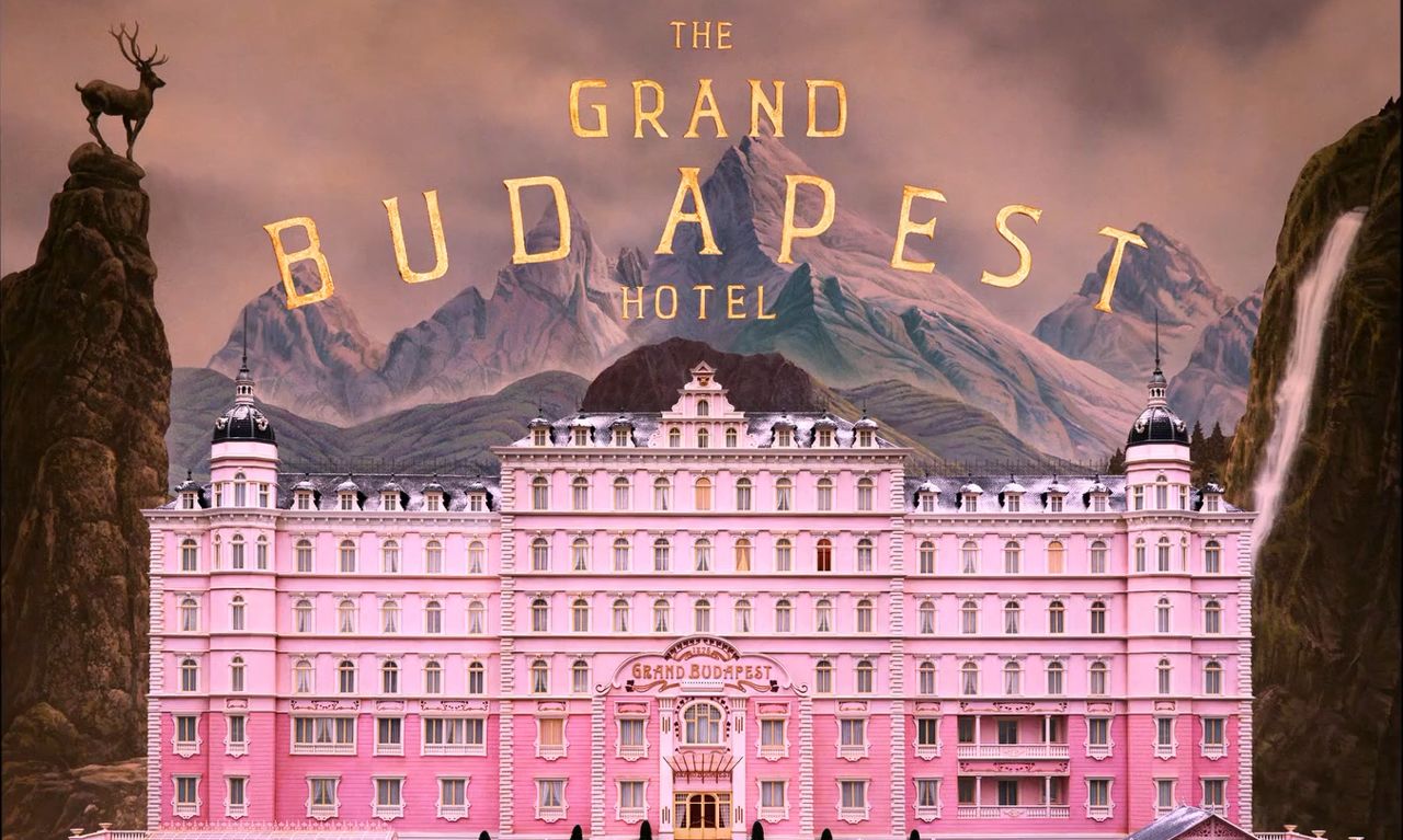
Above: Director Wes Anderson uses colour in a distinct and recognisable way.
Lessons from film
While it is his multiple stylistic choices that have secured his fame, Wes Anderson is a great example of using colour in a distinct way. His use of a controlled colour palette ensures his films remain memorable. Say ‘pink hotel’ and we immediately think of The Grand Budapest Hotel.
On a recent shoot I witnessed a detest for this polarising hue. As a pink backdrop was brought onto set the first AD yelled out in horror; “My God, we’re not using that colour, it’s horrible”. Shooting raw meat has never caused such an uproar, and that’s actual flesh.
Think red and yellow? Think McDonald’s. Go purple and you’ve got that glass-and-a-half from Cadbury.
This anecdote sheds light on how consumers absorb and decode visual cues, illustrating why brands can feel nervous about making bold decisions. The reality is, this boldness only goes wrong if those decisions do not reflect the brand equity.
An international shortage of colour
Think red and yellow? Think McDonald’s. Go purple and you’ve got that glass-and-a-half from Cadbury. Skip to orange and gaze down at the Cheetos dust on your fingertips. These are all brands that have used colour as a distinctive asset, carving out a colourful niche for themselves in the market.
Last year I shot for the Dutch brand Zaanse Mayonnaise. I suggested we design a kitchen in the brand’s colours, something that would make a statement. Taking my inspiration from Pedro Almodóvar's film Parallel Mothers (Almodóvar's use of colour is amazing) I proposed a lovely green and red kitchen. It was a hard no.
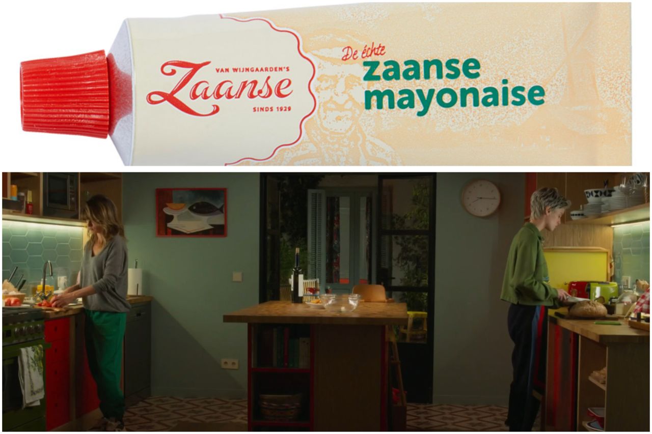
Above: Dutch mayonnaise brand Zaanse decided against using Pedro Almodóvar's film Parallel Mothers as an inspiration for a TV spot.
Quickly, and with great concern, I heard, “I would never paint my kitchen that colour”. The agency felt it didn’t reflect a Dutch kitchen. So, beige it was.
True as this concern may be, self-centred marketing is not how we should be developing brands. This is when we run the risk of being scared to stand out. This shoot marked the first time Zaanse was making a TVC, so the perfect moment to stand out. It’s a fun, punchy, exciting brand that even makes its own merch. Its attitude is about as far from beige as you can get. But, alas, this was an opportunity missed.
There is a pervasive fear at the moment because brands know they speak not only to their loyal consumers, but also to the whole internet of judgement.
To me, the red and green asset was something to embrace. Not because it was simply the brand’s colour, more because, if done well, it would carve a path of distinction for the brand in its category. Because we, as marketers, should base our choices on what the brand represents, not on what we personally feel is too bold.
Fear of falsity
There is a pervasive fear at the moment because brands know they speak not only to their loyal consumers, but also to the whole internet of judgement. Brands want to be ‘cool’. They don’t want to risk getting it wrong, and then being called out for it. So, they choose to blend in. Even if that means becoming bland rather than brand.
But brand marketers, and the craftspeople they’re working with, should embrace what hasn’t been seen, the colours that surprise. There should be a movement towards the unknown, rather than shying away from it for fear of getting it wrong.
Making bold decisions and taking a leap into the daunting world of colour might just be what prevents your brand from blending in.
Credits
powered by
- Agency INGO/Stockholm
- Production Company Colony
- Director Markus Ahlm
-
-
Unlock full credits and more with a Source + shots membership.
Credits
powered by
- Agency INGO/Stockholm
- Production Company Colony
- Director Markus Ahlm
- Ad Agency Publicis/Madrid
- Ad Agency DAVID/Miami
- Art Director Max Hultberg
- Art Director Sergio Takahata
- Chief Creative Officer Francisco (Pancho) Cassis
- Chief Creative Officer Eduardo Marquez
- Chief Creative Officer Eduardo Marques
- Copywriter Magnus Ivansson
- Copywriter Pablo Murube
- Executive Creative Director Bjorn Stahl
- Executive Creative Director Jorg Riommi
- Executive Creative Director Pablo Dachefsky
- Group Creative Director Jean Zamprogno
- Group Creative Director Fernando Pellizzaro
- Producer Markus Ahlm
- Senior Art Director Camilo Jimenez
- Edit Company/Sound Design Colony
- Editor Online Erik Lindahl
- Sound Designer Quint Starkie
- Colorist Jean-Clement Soret
- DP Viktor Kumlin
- Producer Lena Von Der Berg
- Producer Jenny Steggo
- Art Director Ivan Montebello
Credits
powered by
- Agency INGO/Stockholm
- Production Company Colony
- Director Markus Ahlm
- Ad Agency Publicis/Madrid
- Ad Agency DAVID/Miami
- Art Director Max Hultberg
- Art Director Sergio Takahata
- Chief Creative Officer Francisco (Pancho) Cassis
- Chief Creative Officer Eduardo Marquez
- Chief Creative Officer Eduardo Marques
- Copywriter Magnus Ivansson
- Copywriter Pablo Murube
- Executive Creative Director Bjorn Stahl
- Executive Creative Director Jorg Riommi
- Executive Creative Director Pablo Dachefsky
- Group Creative Director Jean Zamprogno
- Group Creative Director Fernando Pellizzaro
- Producer Markus Ahlm
- Senior Art Director Camilo Jimenez
- Edit Company/Sound Design Colony
- Editor Online Erik Lindahl
- Sound Designer Quint Starkie
- Colorist Jean-Clement Soret
- DP Viktor Kumlin
- Producer Lena Von Der Berg
- Producer Jenny Steggo
- Art Director Ivan Montebello
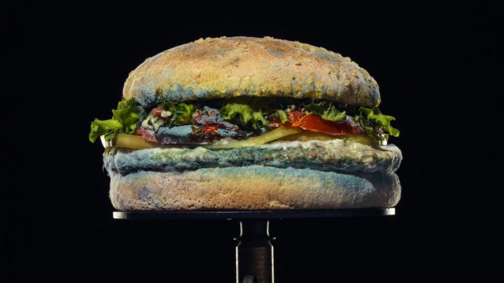
Above: With food, it's hard to break the standard rules in advertising, though Burger King’s Mouldy Whopper gave it a go.
Your craft is your tactic
When it comes to the depiction of food, it is hard to break all the rules (although Burger King’s Mouldy Whopper sure tried) because we eat food. So, we still want to look at something edible.
What makes you distinctive makes you memorable.
But, whether it’s the colour of your packaging, the shape of your bottle, the swirl of your liquid or the dust you leave on someone’s fingertips, what makes you distinctive makes you memorable. Whether consumers love it or hate it.
And with colour? Well, that’s how you really imprint yourself in a consumer’s memory.


 + membership